In Q3 the MozReview team started to focus on tackling various usability issues. We started off with a targetted effort on the “Finish Review” dialog, which was not only visually unappealing but difficult to use. The talented David Walsh compressed the nearly full-screen dialog into a dropdown expanded from the draft banner, and he changed button names to clarify their purpose. We have some ideas for further improvements as well.
David has now embarked on a larger mission: reworking the main review-request UI to improve clarity and discoverability. He came up with some initial designs and discussed them with a few MozReview users, and here’s the result of that conversation:
This design provides some immediate benefits, and it sets us up for some future improvements. Here are the thoughts behind the changes:
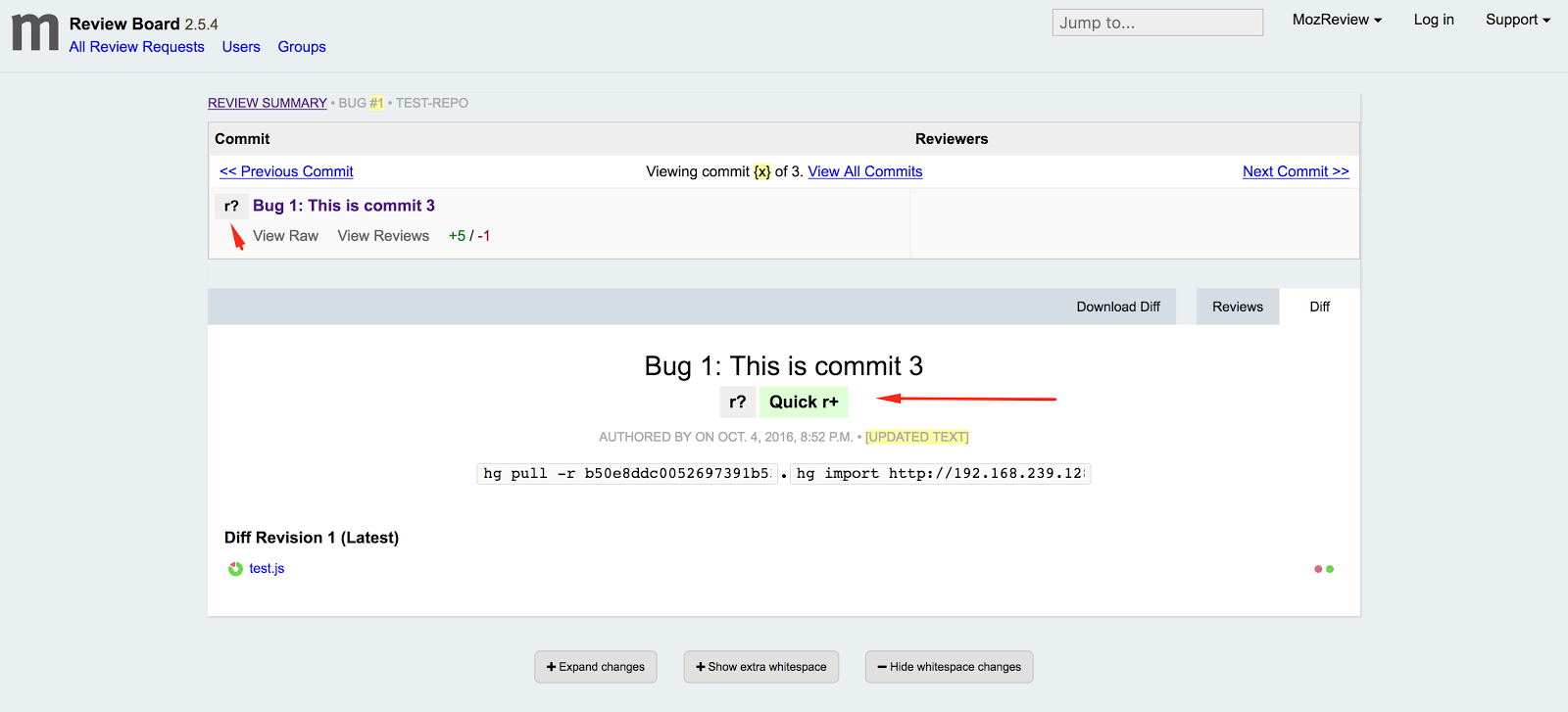
The commits table, which was one of the first things we added to stock Review Board, was never in the right place. All the surrounding text and controls reflect just the commit you are looking at right now. Moving the table to a separate panel above the commit metadata is a better, and hopefully more intuitive, representation of the hierarchical relationship between commit series and individual commit.
The second obvious change is that the commit table is now collapsed to show only the commit you are currently looking at, along with its position (e.g. “commit 3 of 5”) and navigation links to previous and next commits. This places the emphasis on the selected commit, while still conveying the fact that it is part of a series of commits. (Even if that series is actually only one commit, it is still important to show that MozReview is designed to operate on series.) To address feedback from people who like always seeing the entire series, it will be possible to expand the table and set that as a preference.
The commit title is still redundant, but removing it from the second panel left the rest of the information there looking rather abandoned and confusing. I’m not sure if there is a good fix for this.
The last functional change is the addition of a “Quick r+” button. This fixes the annoying process of having to select “Finish Review”, set the dropdown to “r+”, and then publish. It also removes the need for the somewhat redundant and confusing “Finish Review” button, since for anything other than an r+ a reviewer will most likely want to leave one or more comments explaining their action. The “Quick r+” button will probably be added after the other changes are deployed, in part because we’re not completely satisfied with its look and position.
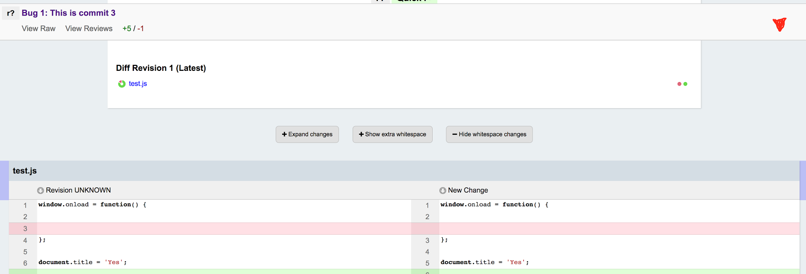
The other changes are cosmetic, but they make various data and controls look much slicker while also being more compact.
We are also noodling around with a further enhancement:
This is a banner containing data about the current commit, which will appear when the user scrolls past the commits table. It provides a constant reminder of the current commit, and we may put in a way to skip up to the commits table and/or navigate between commits. We may also fold the draft/“Finish Review” banner into this as well, although we’re still working out what that would look like. In any case, this should help avoid unnecessary scrolling while also presenting a “you are here” signpost.
As I mentioned, these changes are part of an on-going effort to improve general usability. This refactoring gets us into position to tackle more issues:
-
Since the commits table will be clearly separated from the commit metadata, we can move the controls that affect the whole series (e.g. autoland) up to the first panel, and leave controls that affect only the current commit (right now, only “Finish Review”/“Quick r+”) with the second panel. Again this should make things more intuitive.
-
Similarly, this gives us a better mechanism for moving the remaining controls that exist only on the parent review request (“Review Summary”/“Complete Diff”) onto the individual commit review requests, alongside the other series controls. This in turns means that we’ll be able to do away with the parent review request, or at least make some radical changes to it.
MozReview usage is slowly ticking upwards, as more and more Mozillians are seeing the value of splitting their work up into a series of small, atomic commits; appreciating the smooth flow of pushing commits up for review; and especially digging the autoland functionality. We’re now hard at work to make the whole experience delightful.